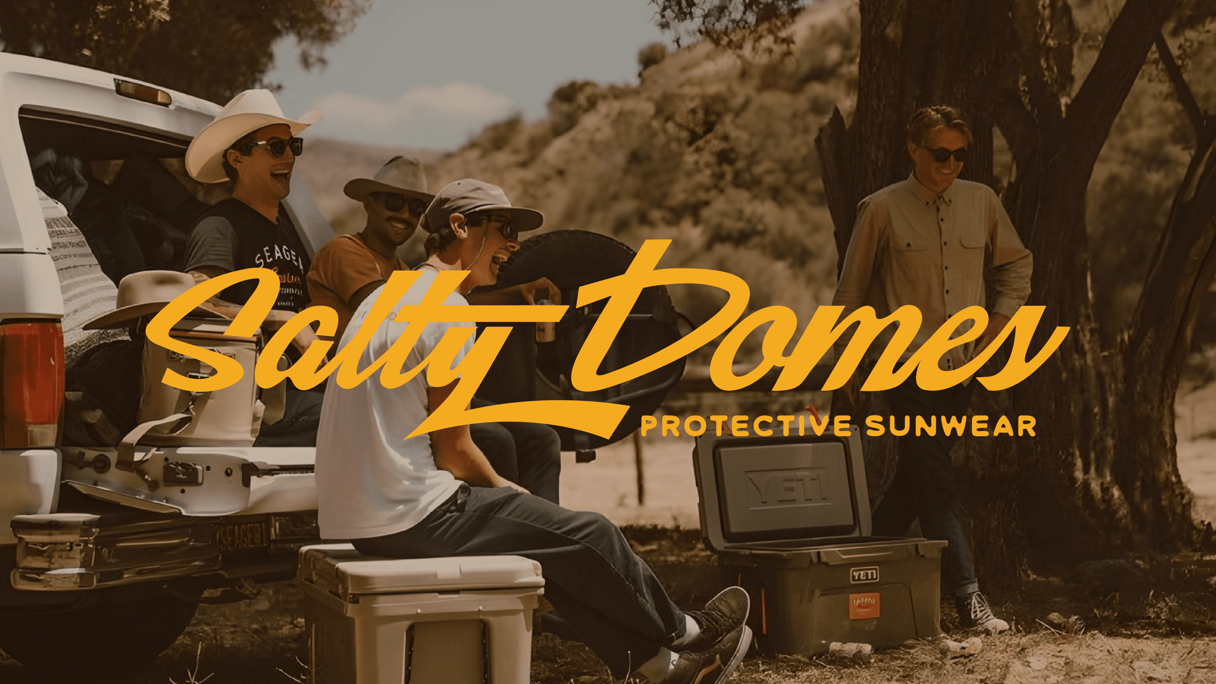


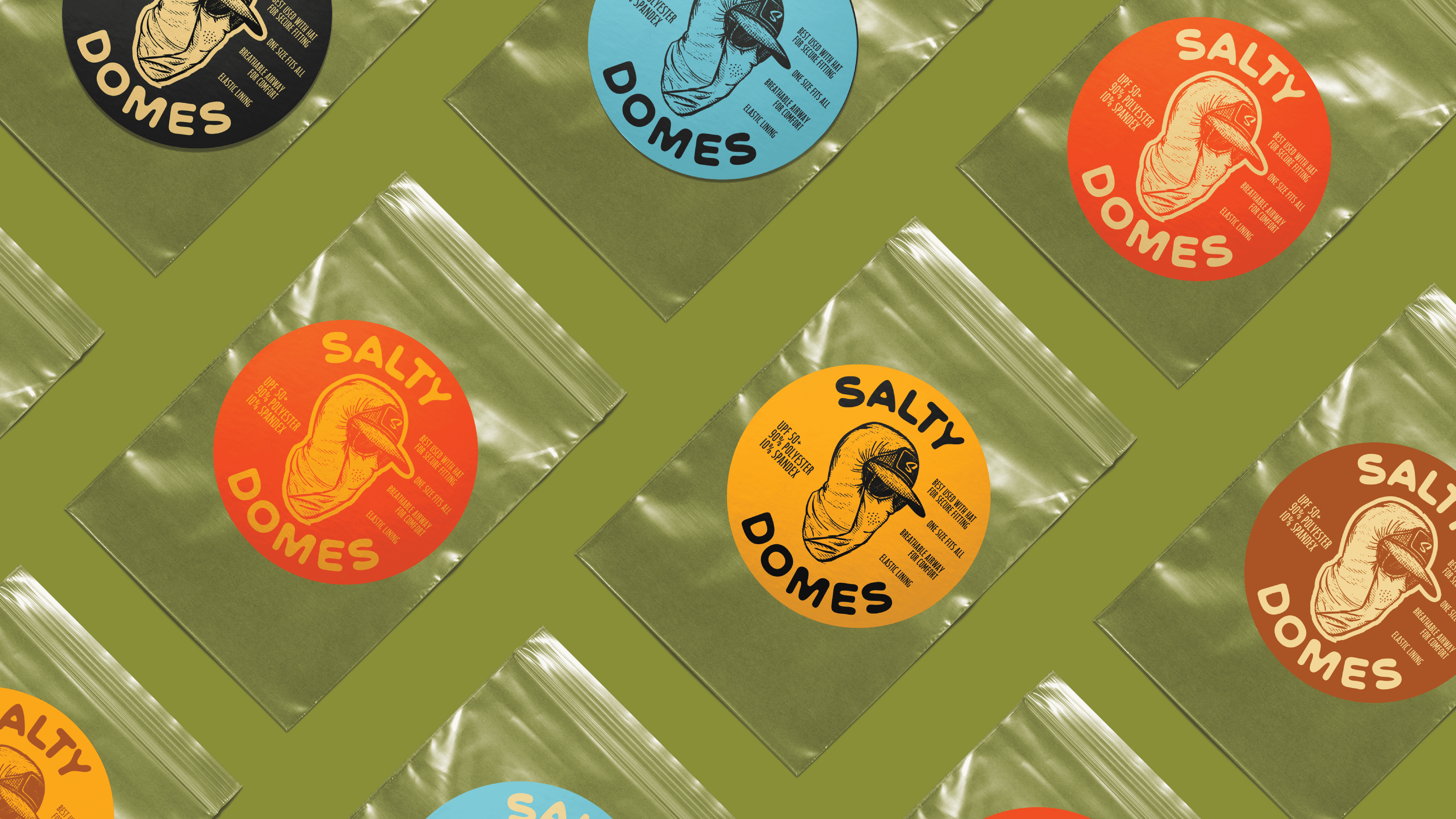
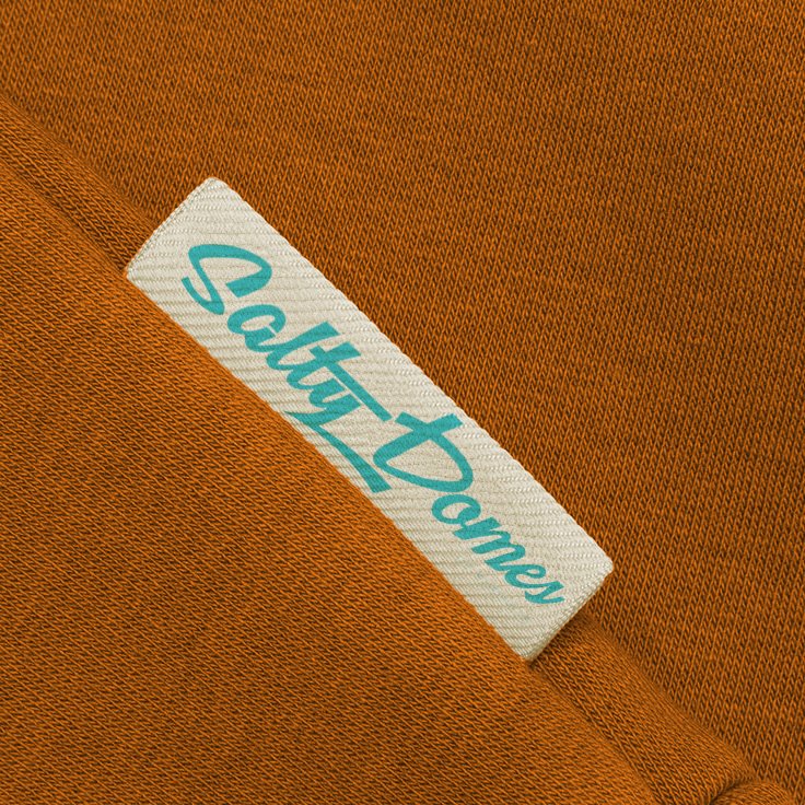

Creation Of Salty Domes Wordmark
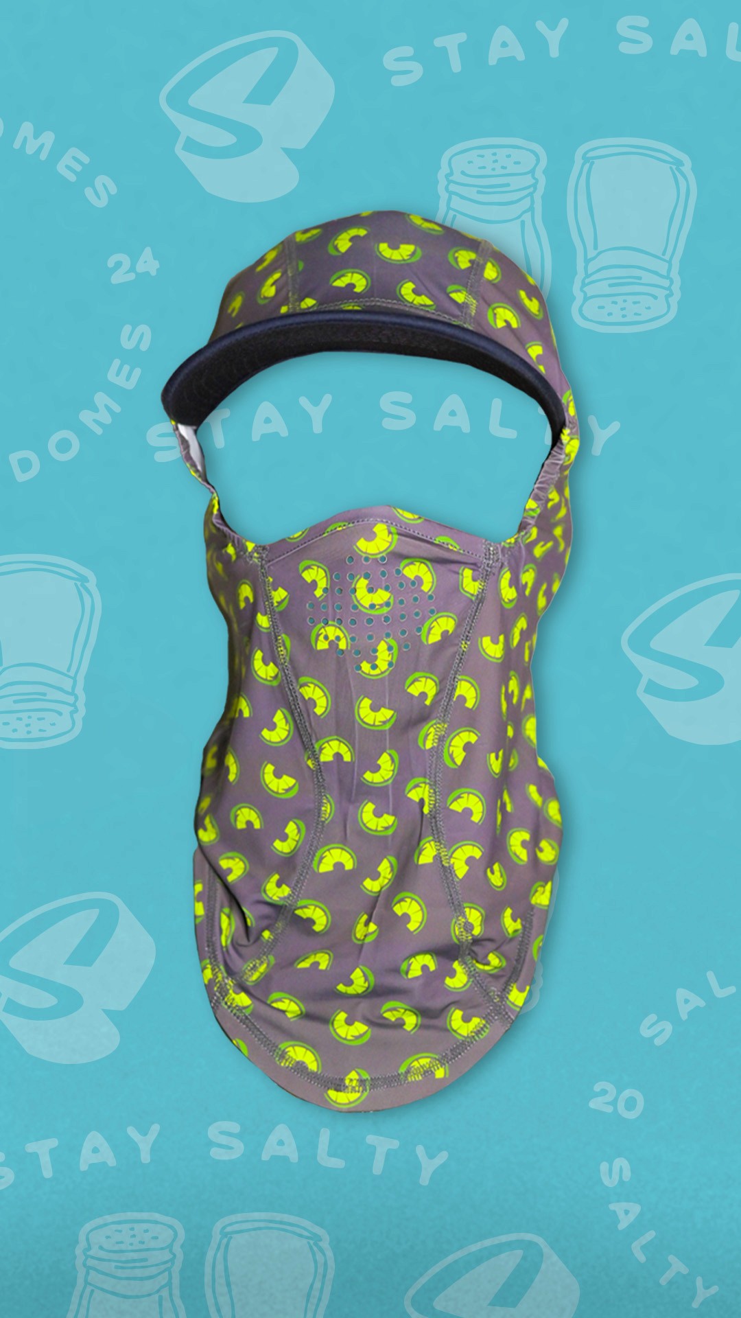
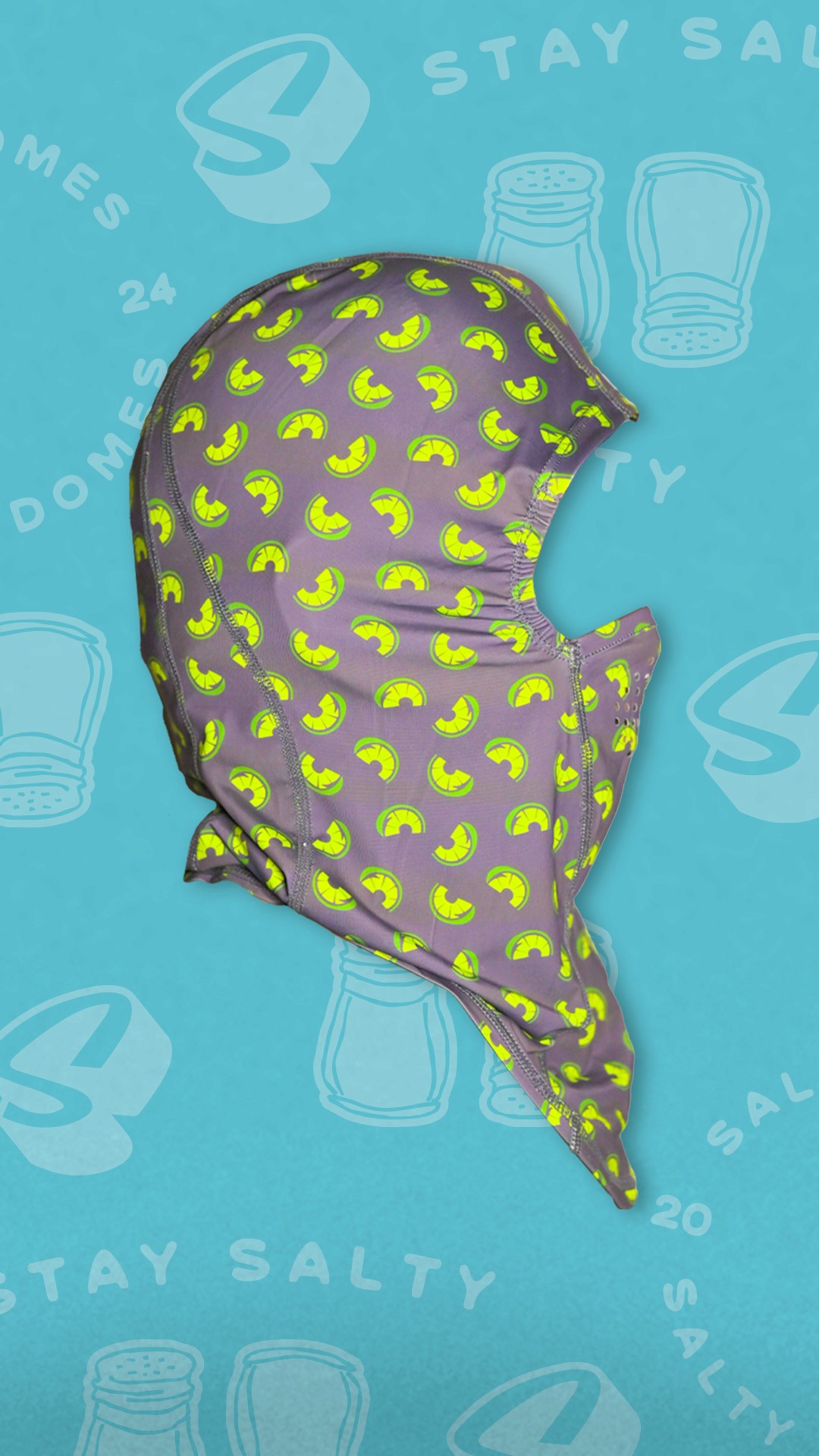
The client wanted something that truly encapsulated the outdoors- he loved the natural shade mangrove roots provided and wanted to somehow incorporate that within the look and feel. To create something as unique as his brand we took a close typeface and sharpened the lines to reflect strength and durability of the brand. We added subtle organic curves to pay homage to the natural elements that inspire the brand and the fishermen niche of his products.
The result is a distinctive and powerful wordmark that not only stands out visually but also communicates the essence of Salty Domes' commitment to kickass, strong, protective gear for fishing enthusiasts.
Wordmark Development:
The creative challenge for Salty Domes was to create a unique wordmark that stood out and embodied the brand's core values of strength and protection. In order to do so I utilized a custom type approach.
Drawing inspiration from the resilience and interconnectedness of mangrove roots. These roots, known for their robustness and ability to thrive in challenging environments, serve as an abstract reference in the design, symbolizing the durability and dependability of Salty Domes products.